


Hopin' third times the charm!
28/10/10 02:19 Filed in: samplesportraits
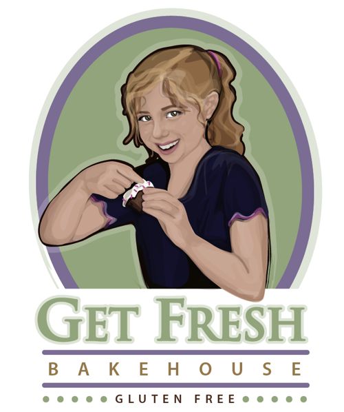
3rd go at this logo. Changing of concepts as far as the meaning of "fresh" in Get Fresh. At first the concept of "fresh" was to be represented by a wink. Hmm, that just didn't work. The second one was just not quite there as the feeling was a bit too "fresh" (as in trouble maker) and wasn't sweet enough. For this third version, we will see if this cute and adorable concept in "Fresh", as in young and fresh, works. (Provided about 6-8 hand drawn rough sketches before that too!) It's all about bringing the right meaning of the store name to a memorable character reference that will please customers.
Some logo concepts go much faster but logo design can be a process until the client hits that eureka moment. Once I spent a week with a corporate client not sure on "just the right shade of brown." That's the job.